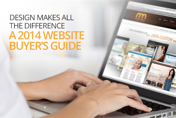
Design Makes All the Difference: A 2014 Website Buyer’s Guide
First impressions mean everything when it comes to establishing relationships. Think back to the first time you met someone very important to you. Whether or not you’d like to admit, a lot of thought most likely went into preparation for the encounter: How should I dress? How much makeup should I wear? How firmly should I shake hands? Should I lead the conversation or instead let them take charge? Depending on how you executed, the relationship either boomed or busted.
So what does this have to do with your practice’s website? Well in this day and age, first impressions aren’t simply limited to face-to-face encounters, particularly in the medical and dental industries. Now that patients are using the Internet as a preliminary way to learn about you and what your practice has to offer before they ever meet you, your website should be designed for what it can potentially be: Your opportunity to make a first impression.
Your website acts as a direct representation of your devotion to quality across all aspects of your practice. By employing the latest, most advanced design elements, you exemplify your dedication to remaining at the innovative forefront of your field. As a first impression, this mirrors the quality of procedures, care, and results you strive to exercise and achieve at your practice.
So without further ado, below are some of the most progressive design elements with which Rosemont Media can equip your site to help you give new patients a memorable first impression in 2014.
Responsive Design
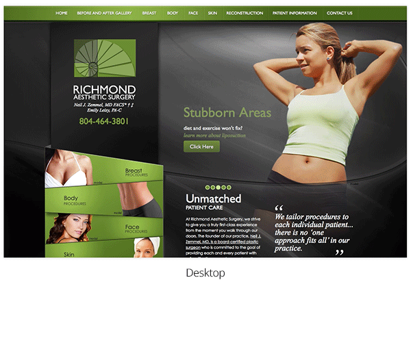
In short, responsive website design refers to your site’s ability to automatically adjust into a user-friendly layout depending on the screen size of the device (desktop computer, tablet, or smartphone) from which it is being accessed. A report by Marketing Land™ released in the latter part of 2013 notes that mobile website traffic makes up roughly 28% of all traffic on the web, a substantial increase from the previous year. This means that with people constantly on-the-go and accessing your site from a variety of different devices, responsive website design is practically vital to ensuring a quality user experience for all. To view a couple good examples of responsive sites, take a look at the websites we designed for True Dentistry and Richmond Aesthetic Surgery. When you have one of the sites pulled up on your desktop or laptop, grab the corner of your browser window and shrink it down until you see how the layout automatically adjusts to better fit the new screen size. Additionally, try accessing either site from a mobile device to view its user-friendly layout.
Flat Design
Flat design is a new aesthetic and function-oriented design that can actually help enhance the performance of your website, particularly when the site is accessed from mobile devices. Whereas previous designs are a bit more glossy and multidimensional, the new flat design takes a minimalistic approach characterized by basic graphics and icon-like features such as social sharing buttons. While you may think such a simplistic design will make your website seem plain and outdated, it’s quite the contrary. Flat design can be used to really make key features of your site pop, quickly grabbing the viewer’s attention. Additionally, it eliminates many design intricacies that can essentially slow the performance of your site.
Parallax Scrolling
Parallax scrolling is a multi-layered design element enabling two objects (say, background and foreground images) to move across the screen at different rates as you scroll down the page. This creates a nice transition between information you want displayed on the page, and it adds a unique element to your site that sets you apart from other, more traditional designs.

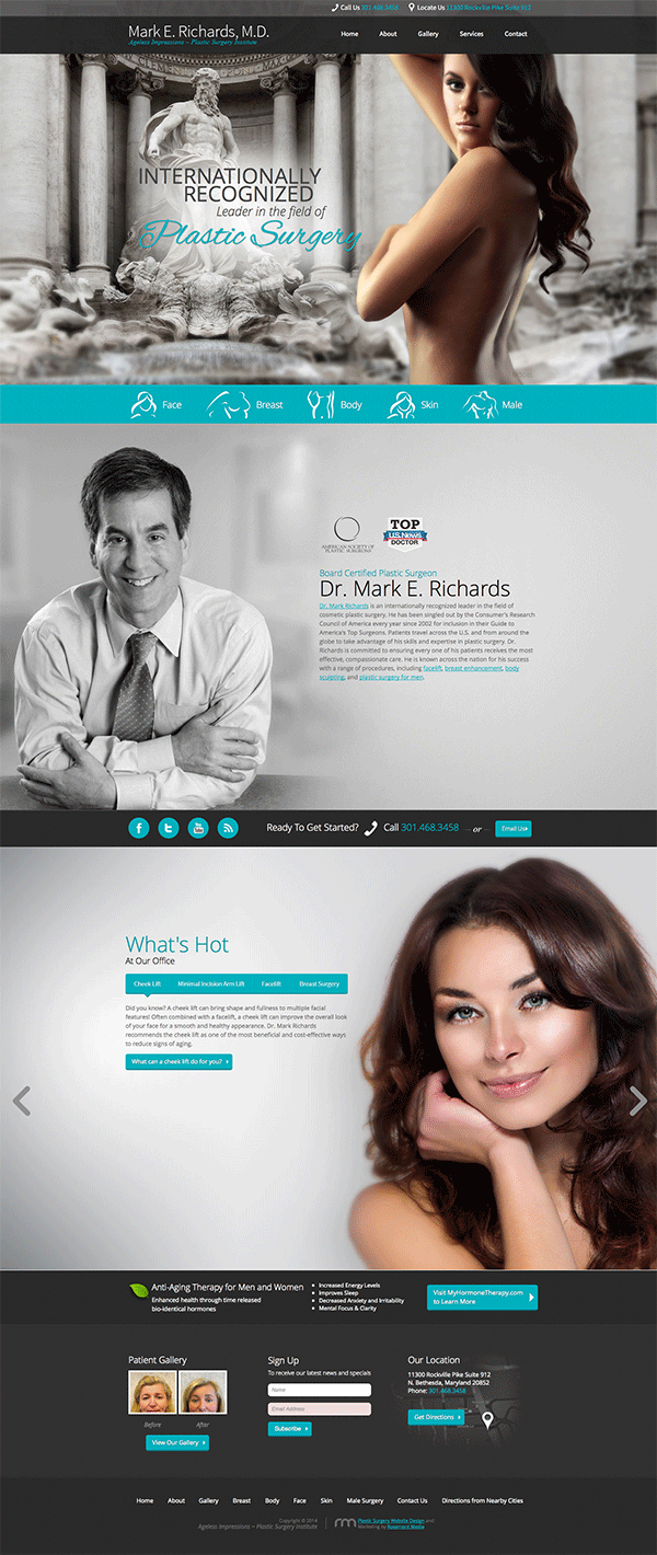
Large or Full Screen Hero Graphic
In the website design industry, a hero refers to the large (or even full-screen) image located in the top section of a website’s homepage. The hero is typically intended to immediately grab the viewer’s attention as it is the first thing they will see when they visit your site. Often graphic-based, the hero can be used to showcase a variety of images, as well as to provide some sort of “teaser” or call to action to get the viewer to stick around and navigate throughout your site.
Redesign Your Website in 2014
As you can see, there are a number of innovative website design elements that can improve both the aesthetics and function of your site in order to help you make a great first impression on your patients. If you are interested in redesigning your website in 2014, please don’t hesitate to contact Rosemont Media. We will be happy to work closely with you to customize a state-of-the-art design that exemplifies your unwavering dedication to quality care.