Responsive Design vs. Mobile Apps and Mobile Sites
“Why should I get a responsive site if I have a mobile site?” and “Should I get a mobile app?” are two questions we get from our clients. We are glad our clients understand that it is time to capitalize on the increase in mobile searches. However, how to best reach potential patients through mobile means can be a confusing subject. Fortunately we have answers and, spoiler alert, we still recommend responsive sites. Here is why:
Mobile Website
What You Should Ask
If you have a mobile site already here are some questions you should consider.
- Is there a subdomain?
- Does your mobile site update automatically with your desktop site?
- Does your mobile site have the right call to actions?
Most mobile sites redirect users to a subdomain site like “m.domain.com” or “domain.com/m” address, which is an outdated and potentially damaging mobile solution. Subdomain sites are a totally separate site which means you need two sets of code (one for your regular site, and one for your mobile site). If your mobile site isn’t coded properly, it can be indexed incorrectly by search engines and damage your SEO (think duplicate content penalties).
Subdomain sites are not linked to your desktop site and will not automatically update when you change your desktop site. This can be nightmarish for developers who have to manually update the mobile site, maintain two sets of code, and do it all correctly or else risk harming the site’s SEO.
Mobile sites have to be built correctly, and they also have to be easy to navigate. Is your mobile site intuitive to the mobile searcher? Chances are, they are looking for your phone number or directions. Make sure your mobile site is enabled with a click to call button, and a click for location button that takes you to Google or Apple maps for easy navigation.
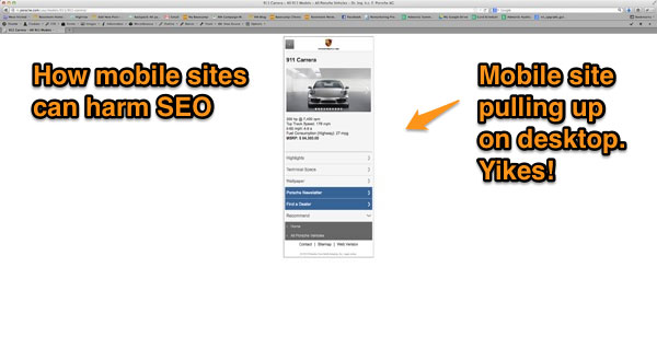
Porsche’s Mobile Mistake
Mobile fail.
What you are looking at is an example of a huge international brand with an incorrectly coded mobile site. Type in “porsche 911 turbo” into Google, and you will see the first Porsche page on the results is actually a mobile site. This should not be happening, the site should know the search is coming from a desktop computer, not a smartphone or tablet.

SEO nightmare.
This example shows how hard it can be to get a mobile site right, even with all the money and developers you can buy. This wouldn’t happen if Porsche had a responsive site!
The Bottom Line
The problems with mobile sites depend on the type you have. Better to start the right way to begin with, if you start with an subdomain site you will have to redo it since they are quickly becoming obsolete. If you are researching mobile sites, read what we have to say about responsive sites.
Mobile App
What You Should Ask
If you are considering paying for an app to be made, ask yourself the following questions.
- What is the function of the app?
- Are potential patients going to be looking for your practice in the app store?
Apps are usually for a specific need, that can be used by millions of people. We have heard clients wanting to make appointment or practice-specific apps. We say for our clients, there aren’t any functions served on an app that can’t be served on a website. Any budget for development of a mobile app would be better spent on building a responsive site.
Let’s say you want to expand your patient base. Where are they going to find you? Are potential patients going to go into Google Play and type in “cosmetic dentist? No, they are going to go to Google’s search page and type in “cosmetic dentist”. And you better have an quick loading responsive site ready for them!
The Bottom Line
Apps are made to appeal to the masses, and a niche appointment app for your practice isn’t going to cover the costs it takes to make it. That money would be better spent making a responsive site to reach all your patients, and potential patients. Websites can educate through procedure pages and blogs. They can schedule appointments and provide directions. And everyone uses websites. You don’t need to reinvent the wheel. Stick with what works and where your patients are: on search engines not in an app store.
The Best Solution: Responsive Design
We can confidently say responsive design is the best mobile solution because our search leader, Google officially endorsed it as such. Responsive sites use only one set of code and are the best option for SEO. Not to mention as screen sizes continue to multiply, having automatic resizing for each screen will create the best user experience for your visitors. Instead of sinking money into an app or mobile site, start fresh with the latest technology that will give you the best SEO and visitor experience.
Whether you already have a mobile site or would like to upgrade a desktop site to current web design standards, call us for an assessment of your site.