Introducing Rosemont Media’s Website 5.0
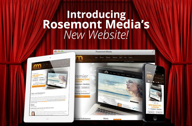
Today we unveiled Rosemont Media’s new website – dubbed version “5.0” for the five years we have been in business. At Rosemont Media, we take pride in building custom websites for our clients’ practices while utilizing the latest developments in programming, design, and SEO strategy. After countless hours devoted to our clients’ sites, we got to thinking: What about our website? As the premier website marketing agency for the elective healthcare industry, we also wanted our site to be the leading example of custom responsive sites. So after many months of hard work, we are excited to present our new website!
To learn about the new features of the site, we interviewed some key contributors to the website redesign:
Keith, CEO
How did you know you wanted to have a responsive site?
Our first site was built in 2008, and we have been long overdue for a facelift. We like to use our company to beta test our products in order to be sure of their success before introducing them to our clients. Our site is built in WordPress, and over the years we have been very happy with the results. All our client sites are built in WordPress, and the same goes for responsive design. With responsive website design here to stay, we are excited to bring this technology to our clients.
Why not just stick with a desktop and mobile site?
We have been experimenting with responsive design since the beginning stages of the technology, and we knew this was where web development was heading. After Google endorsed responsive design, we were absolutely positive we had to be the leaders in developing responsive sites. We even launched a few responsive client sites before our own.
What does this mean for desktop-only websites?
We feel desktop-only web design is about to become obsolete. Besides, our clients will see greater benefits for their practices from having a responsive design versus a desktop-only design.
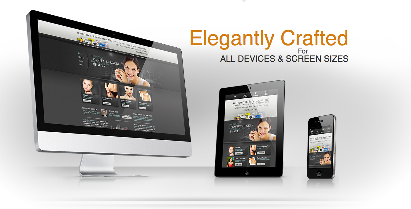
How responsive sites render on different devices
Courtney, Product Manager and Project Manager for the Redesign
What are your three favorite features of the new site?
My favorite feature is definitely the fact that the site is responsive. Because of this, our current clients – and of course, potential clients – can learn about our products and services from whatever device they choose, all while receiving the same experience.
Next is the site’s stimulating format. There is subtle a blend between content written to educate readers and content written for SEO purposes. Every page has relevant images that guide the reader through our site. Having a balance of content, images, and white space makes reading the website easier and makes the site look great!
And last is our gallery. Working on this project and looking through all of the quality sites we built makes me proud. We are only going to get better and I can’t wait to see what the future holds for Rosemont.
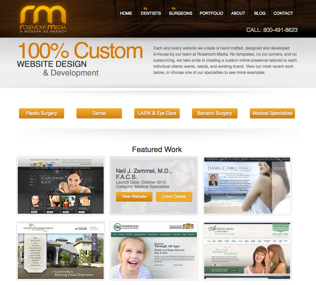
Rosemont’s surgeon portfolio page
Cory, Lead Developer of the Redesign
What do our readers need to know about the site?
We built the site with the client in mind. We wanted the site to be easy to navigate – complete with information on our products and services as well as a gallery to showcase our work. There is contact information on every page, so no matter what page the reader is on, there is always a way to contact us.
What does responsive design mean from a developer’s perspective?
The responsive design makes the website scale to any size screen. This is helpful from a design standpoint because we know our layouts will show as we designed them, no matter what size device is accessing the site. With unresponsive desktop sites that are pulled up on smartphones, content can be cut off, loading time is slow, and the user experience is poor. Responsive keeps our design as we made it, so we know it is loading fast and that all the content is displaying on one screen.
What about the blog?
The blog looks great. It is easier to read, and we carefully categorized and archived all posts. It will also be easier for readers to research a specific topic.
Check it out
We invite you to click around our new site. Read about our products, find out what our most popular blog posts have been, and see examples of websites we have designed in our gallery. Let us know if you have any questions about starting the redesign of your site.